Showing posts with label color. Show all posts

Friday, March 1, 2013

Go for the Gold!


If you’re revamping any part of your home and want to make a statement, why not dare to do gold? It’s beautiful, it goes with every color, it fits in any room, and hardly anyone has it in their homes yet! I’m obsessed with the way gold was incorporated into the rooms below. It’s as if the designers chose the color first and the rooms just fell into place! 

Here are some examples of gold being used in every room in the house:


Bathroom:


I adore the gold tiles in this bathroom. Look how gorgeous the colors of the dark mirror and the flower become against the metallic wall! (Metallic colors in bathrooms is so in right now. Check out this post from last month featuring silver + bronze bathrooms).

http://www.paulagracedesigns.com/blog/
 
Bedroom:

http://pinterest.com/pin/220254237998140097/
From floor to ceiling this bedroom pops with this magnificent color. If you want to bring gold into your room but not quite to this extent, start with jazzing up a wall (with the great wallpaper below), or getting a gold bedspread and/or appliances.

http://www.ebay.co.uk/itm/Crocodile-Leather-Effect-Metallic-Gold-Wallpaper-Maximum-carriage-charge-7-50-/290663159117
?pt=UK_Wallpaper&hash=item43acdfd54d#ht_1877wt_956
 
Kitchen:


These are two heart-stopping examples of just how incredible gold can look in a kitchen. Whether it be a backsplash, a lighting fixture or cabinets, kitchens can turn into majestic rooms with a little addition of gold. 

http://misswalker.blogspot.com/2011/06/milan-report-gold-rush.html?showComment=1307496747443
http://www.thecoolhunter.net/
 
Living Room:


Speaking of majestic, these accents make these sitting rooms luxurious beyond belief. You can match the furniture like the first photo, or make it contrast like the second. Either way, living rooms are great homes to gold accent walls.

http://www.fauxology.com/2011/02/good-as-gold/
https://brightnest.com/posts/7-steps-to-perfect-wallpaper-modern-paper-options/
http://pinterest.com/pin/235524255484688663/
 
Do you have any gold accents in your home? If so, please share! I’d love to hear about your use of this glorious color.


Happy decorating! And don’t forget – design the life you LOVE!

Tuesday, April 10, 2012

Color Blocking: Spring and Summer Trends

We’ve seen it on the runaways, clothing racks and make-up counters. “Color blocking.”  It’s the hottest trend of the year that involves the mix of solid colors in daring ways. Similar to mixing prints, the method combines two or more colors that include bright, complimentary and contrasting shades.  Orange, green, yellow, and blue are some of the most popular combinations.  If you’re daring enough to wear the combos, then you may find that the same mix will provide an artistic twist in your home as well.


Before you get started, keep these tips in mind.

·         Remember the rules of color. The color wheel is a perfect guide if you’re confused on what works. The rules are: colors directly next to each other (i.e. yellow-green); those that create a ninety- degree angle (i.e. green and orange); colors that form a “T” (think blue, orange and violet-red) and so on.

·         Try to stick to a maximum of four colors. The idea is to add bold touches, but you don’t want it to come across as being too wild and psychedelic.

·         Minimize the number of pieces in each room that display the method. Keep it simple.


Here are a few examples that you can use as inspiration.

KITCHEN

    Courtesy of Designernotes.modwalls.com

The kitchen is a great place to spice it up if you desire a modern look. The combination of yellow and orange on the walls complement the dark finish of the cabinets. If you have lighter color finishes, you can use more cool tone pallets such as mint green and light blue.


LIVING ROOM

      Courtesy of cococozy.com                   

Simple splashes of color on the walls can be a great complement to accent pillows on the sofa and other décor such as chairs and tables. Try to keep the color choices to a minimum of two on the actual walls, and mix and match throughout the room with simple touches as displayed in the picture above.


WINDOW TREATMENTS

      Courtesy of cocoonhome.com

Bright window treatments are a great way to temporarily add the trend in a room if you don’t want to go bold and paint the walls. You can mix up to three to four colors, but ensure that the colors complement the main pieces in the room such as the sofa and chairs.

You can also try the trend by adding color to a small section of the wall as a backdrop to a picture frame and painting dining room chairs using two different colors.


Color blocking is a fabulous way to add a modern twist when the trend is kept simple and chic. Remember to have fun and don’t be afraid!


Design the life you love.

Wednesday, January 25, 2012

Are you afraid to take a risk in your space? These ideas will help you spice up your space but prevent you from going overboard.

It is the beginning of a new year which sometimes makes us more open to change or inspired to mix things up. Sometimes just adding a new color, fabric, or print to your space can give it some added interest. There are various reasons as to why many of us are afraid to take a little risk with our space, but regardless of what those reasons are, we can all change things up in some way or another.


We have a few different ideas for you to add a splash of color or a fun print to your space without it becoming overwhelming. The first is the easiest and most likely the least expensive route to take. Pick one or a few of your favorite colors whether they are solids or in the form of a print to make throw pillow cases out of. This is a great opportunity to add some texture as well. Cut velvets are big right now and can add a luxurious feeling as well. The image below is a great example of a vibrant print on a pillow from Designer’s Guild along with a beautiful throw blanket.

Designer's Guild
Window treatments are something that may not be inexpensive to change but they are something that is relatively easy to change. They can soften up a room, make it more cozy, and definitely add some color. This is a great way to showcase a print you love. The fabric for the window treatments are from Designer’s Guild.

Designer's Guild
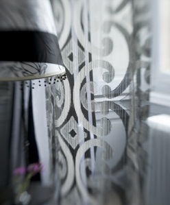
Black is often considered a risky color to use especially in larger amounts. Sheer black window treatments can provide a sleek contrast to a room that is very bright without being too heavy.

Designer's Guild
If you love prints, printed sheers can be a great option as well. This is a beautiful sheer from Designer’s Guild used for a window treatment.

Designer's Guild
Wall coverings are back! There are so many new textures, prints, and colors available to add visual interest to any interior. If you have a smaller space such as a powder room, try adding a wall covering to make the space more unique. If you select a wall covering that is slightly reflective it may make the space feel bigger as well.

Laura Casey Interiors, LLC
Color and style trends change with interiors just like fashion does but that doesn’t mean we can’t take advantage of what the current trends have to offer! Hopefully these ideas will help you brighten up your space and bring it to life. Design the life you love!